Showing posts with label PAPERTREYink. Show all posts

Friday, May 11, 2012

JAI 117 - Colour Challenge

This week at Just Add Ink, we have, what I thought was the hardest colour challenge ever!   Take a look


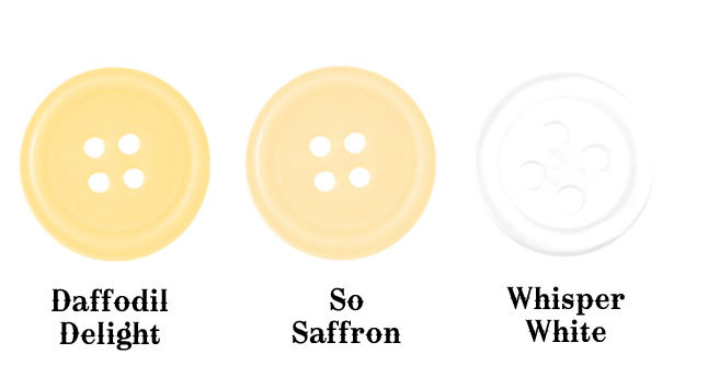
Looks pretty inoccuous but, boy, did I struggle with this.  It was SO hard to pair these colours together.  When I found something that would work with one, it would look awful with the other.  I think I went through 2 sheets of cardstock before I found a stamp set that I thought worked with them.  What do you think?


I really like how it turned out, and I finally used this set, which I really love, but hadn't used since I bought it.  The big and little circles (I guess that's what you'd call them) are stamped in So Saffron and the middle sized ones are stamped in Daffodil Delight.  The sentiment panel is Daffodil Delight, with the sentiment embossed in white EP.  I used a bit of bling to highlight the centres.

Make sure you check out what the rest of the DT have come up with - they didn't stuggle like I did and there are some beautiful cards for your inspiration.

Thanks for visiting and I hope you have a wonderful weekend.

Supplies Used:  All Stampin' Up! unless otherwise noted
Stamps:  Happiest Birthday Wishes, Spot Dot (PTI)
Ink:  So Saffron, Daffodil Delight, Tim Holtz Distress Embossing Ink (Ranger)
Cardstock:  Whisper White, Daffodil Delight
Accessories:  Heat Tool, White Embossing Powder, Basic Jewels - Rhinestones

Sunday, April 29, 2012

Colour Q 134 Challenge

Afternoon

For some time now I have wanted to play along with the Colour Q Challenges for quite some time but it has just never worked out.  After a bit of tidying in the studio last night, I decided to see when this week's challenge closed, and as it turned out, I still had time to play along.

This is the colour combo for this week


And this is what I came up with


I used my new Apothocary Art set and the coordinating Labels Collection framelit.  I used my blender pen to colour the flowers using Calyspo Coral and Pumpkin Pie inks, the main image and sentiment are stamped using Bravo Burgandy - I think this is the 2nd time I've used it in 6 years.  The sentiment is from a PTI Anniversary set - Round and Round.  The background has been stamped using PTI's Background Basics - Tin Types using Pool Party ink.

I know it's really simple but I really like  how it has turned out.  And now I have realised that if I can make it down to the studio on a Saturday night, I can play along with Colour Q more often - yay!

Thanks for visiting and I hope you are enjoying your weekend.

Supplies Used - All Stampin' Up! unless noted otherwise
Stamps:  Apothocary Art, Background Basics - Tin Types, Round and Round (PTI)
Cardstock:  Pool Party, Watercolour Paper (LSS)
Inks:  Pool Party, Calyspo Coral, Bravo Burgandy, Pumpkin Pie
Accessories:  Big Shot, Framelits - Labels Collection, dimensionals, corner rounder (retired)

Wednesday, April 25, 2012

JAI 114 - Just Add Jodene

This week the challenge at Just Add Ink was to Just Add Jodene - meaning CASE one of Jodene's gorgeous creations.  This week is my 'off' week but with today being a holiday for ANZAC Day, I was able to get down to the studio to whip this up


This is the card that I CASED.  I love the die that Jodene used on her card, it's actually on my wish list so I had to improvise.  I've used the Lace Ribbon Border punch to punch a few rows out and have adhered them to the card front using Mono Multi liquid glue - not my favourite method but my punch nearly had a heart attach when I last tried this with the all purpose adhesive sheets behind it.  The frame and sentiment are from PTI Mat Stack 2 set and die cut.

Well, that it from me - heading off to Roast Night at the outlaws since there is no Zumba tonight.  I'll be back on Friday with my DT submission.  Hope you can stop by then.

Thanks for visiting

Supplies Used:
Stamps:  Mat Stack 2 (PTI)
Ink:  Baha Breeze, Going Grey (retired - sad)
Cardstock:  Whisper White, Baha Breeze
Accessories:  Big Shot, Tombow Mono Multi Liquid Glue, Lace Ribbon Border Punch, Baha Breeze Seam Binding, Mat Stack 2 die, Mat Stack 2 Layerz die, Dimensionals

Friday, March 2, 2012

JAI #107 - Just Add Nikki Spencer

Howdy

This week at Just Add Ink we have a super fun challenge and that is to Just Add Nikki Spencer.  I had a lot of fun doing this, although chosing just one of Nikki's gorgeous cards was a little difficult.

This is my take on Nikki's super cute card


Now I have to tell you, when I was cutting my cardstock and punching my owl bits & pieces, I delusionally thought that I would be able to make four of these cards in the 1-1/2 hrs I had to spend in my studio.  Delusional, I tell you!!!!!!  It took me the whole 1-1/2 hrs just to put THIS ONE together.  I seriously need to be banned from using any type of liquid glue.  We just do not get along!  After a getting glue all over everything, and I mean everything, I decided to stick this owlie together with Dotto, so I could place the pieces (and move them) where I needed to!  I also decided to use my gel pen to finish off the eyes, managing to smudge one in the process (arrgh).  Anywhoo, after all the mess, I'm quite happy with the way it turned out, and I have all the bits & pieces ready to make another 3 cards.  Not quite sure how much time I will need to complete those though, LOL!

The Design Team have got some fabulous interpretations of Nikki's gorgeous cards. be sure to check them out and I look forward to seeing what you choose to CASE

Thanks for visiting and have a fantastic weekend.

Supplies Used:  All Stampin' Up! unless noted otherwise
Stamps:  Bitty Baby Blessings (PTI)
Ink:  Versamark
Cardstock:  Bashful Blue, Soft Suede, Whisper White, Bashful Blue DSP, Red Glitter Paper
Accessories:  Owl Builder punch, Dotted Scalloped Ribbon Border punch, White Embossing Powder, Heat Gun, White Gel Pen, 1-3/4" RD punch, Corner Rounder (retired), Big Shot, Limitless Layers 1-3/4 RD Die Collection (PTI)

Friday, December 9, 2011

JAI #97 - Just Add Inspiration

Good Morning

This week at Just Add Ink the challenge is to use this photo I found in a Vogue, or maybe it was Harper's Bazzar I was flicking through whilst I was the hairdressers as inspiration for your creation.  (It will also explain the average photo as it was taken with my phone.)

Here it is

Of course, I fell in love with it, because, after all, it is an advert for Tiffany & Co, but I thought these little purses in such vibrant colours were just to die for.  Santa, if you're reading this, I would not be sad to see the pink one, or the blue one under our Christmas tree *wink*

I thought the colours in the photo looked very much along the lines of Poppy Parade, Pool Party, Melon Mambo and Lucky Limeade, so they are the colours, along with a bit of silver that I have chosen to work with. 

And this is what I came up with


I cannot tell you how many versions of this I went through to eventually end up using this 'test' piece.  I tried it using my treasured textured Whisper White, with the Melon Mambo stamped off once, with it at full strength,with the Poppy Parade being brushed on using a marker, with the Poppy Parade being rock'n'rolled, with it being stamped on watercolour paper, with it being spritzed with water on watercolour paper, with 3 spritzes not being enough and 4 being too many - OMG it just went on & on & on.  In the end, I chose this one that was on plain Whisper White, with the Melon Mambo being stamped off once and the Poppy Parade being rock'n'rolled on.  The sentiment is from the same set and was stamped in Encore Silver and embossed with Silver embossing powder.  This should have taken 15 - 20 mins max, instead of the nearly 1-1/2 hours it actually did.

I hope you enjoy this inspiration photo and look forward to seeing your creations.  Be sure to check out what the rest of the Design Team have come up with too.  As usual, lots of beautiful creations to inspire you.

Thanks for visiting and have a wonderful weekend

Supplies Used:  Stampin' Up! unless otherwise noted
Stamps:  Botanical Silhouettes (PTI Anniversary set)
Ink:  Melon Mambo, Poppy Parade, Lucky Limeade, Encore Silver (retired by SU! but probably still available elsewhere)
Cardstock:  Whisper White,. Pool Party
Accessories:  Silver embossing powder, Heat Tool, dimensionals

Friday, November 11, 2011

JAI #93 - Colour Challenge

This week at Just Add Ink we have a colour challenge, check out these gorgeous colours that Kim picked out for us


I must admit though, I did struggle a little with them, especially the Melon Mambo, which is a tad bright compared to the others.  It took me 5 goes to come up with this


I've found myself in a bit of a 'packaging' mode and decided to give my unused Pillow Box die, which by coincidence, is part of the Stampin' Up! promotion this month, a whirl.

I cut it out of Whisper White and stamped it in alternating bands of colour.  The sentiment is stamped in Pool Party and punched out using the Modern Label Punch.  I used a couple of rhinestones to accent the tag, and tied it all up using the Organza Ribbon, which is one of my absolute favourite ribbons.

I'm off the the Stampin' Up! Regionals in Melbourne this weekend and I'm looking forward to catching up with all my stamping friends, many of whom I only see at this event. 

Make sure you check out the rest of the Design Team's creations - lots of pretty inspiration for you.  Thanks for visiting and I hope you have a wonderful weekend.

Supplies Used:  All Stampin' Up! unless specified otherwise
Stamps:  Faux Ribbon (PTI)
Cardstock:  Whisper White
Ink:  Pool Party, Certainly Celery, Melon Mambo
Accessories:  Big Shot, Pillow Box die, Modern Label Punch, Rhinestones, Organza Ribbon

Friday, October 28, 2011

JAI #91 - Colour Challenge

Wow, it feels like it's been ages since I've posted on here, well it probably has been.  Last Friday I had my first workshop in a very long time.  Oh my, I was so rusty, so many things had changed, hope I didn't mess up to bad.

Anyway, on to the challenge this week at Just Add Ink, we have a colour challenge - Blushing Bride, Cherry Cobbler and a Neutral of Choice


I was just thinking to myself I probably took the easy way out using Whisper White as my third colour, turns out it's what I should have been using anyway.  OMG, I really need to READ what the challenge is.  It wouldn't be the first time I have made a mistake because I didn't read the challenge properly.

This is what I made


and this is what is inside


This is the Sizzix Box #2, which holds these 2 pieces of fudge just perfectly.  I found the fudge at Aldi when doing the shopping, it was very reasonably priced and I thought they would be great for gifts for the staff at my son's Kinder.

For this one, I have stamped the polka dot image in Versamark and embossed using Cherry Cobbler embossing powder.  Can I just tell you how much I love the fact that SU! are offering coloured embossing powder.  I LOVE heat embossing - it's one of my favourite techniques.  I must admit I probably wouldn't emboss for more than one of these cause it was a little time consuming, but it adds that little bit 'extra' for the challenge.

The tag is from the Tags till Christmas set, which I was lucky enough to win during Prize Patrol at Convention this year.  It has also been embossed with Cherry Cobbler embossing powder and punched out using the Decorative Label Punch.  It was all tied up using White Organza ribbon.

The box is super easy to put together and depending upon how you decorated them, you could whip lots of them up in no time at all.

Well, that's all from me today.  Be sure to check out the rest of the gorgeous creations the Design Team has come up with - lots of wonderful inspiration, as usual.

Thanks for visiting and hope you have a wonderful weekend.

Supplies Used:  All Stampin' Up! unless otherwise noted
Stamps:  Tags Til Christmas, Polka Dot Basics 2 (PTI)
Ink:  Versamark
Cardstock:  Blushing Bride, Whisper White
Accessories:  Embossing Buddy, Heat Tool, Cherry Cobbler Embossing Powder, Big Shot, Sizzix Box #2 die, Sticky Strip, White Organza Ribbon, Decorative Label Punch, pretty silver cord.
Fudge from Aldi

Friday, September 30, 2011

JAI #87 Colour Challenge

This week at Just Add Ink, we have a colour challenge using a couple of the new In Colours - here they are

I must admit, the last few weeks I've been suffering from a lack of inspiration and this week was no exception.   I really had no idea of what I was going to do with these pretty colours until I came across some sketches I downloaded from PaperCrafts Magazine - I think they were the basis for their Card Ideas for Paper Crafters edition, but I can't find the link for where I downloaded and printed them out from now, sorry.

Anyway, this is what I came up with


It's a little embarrassing to admit it took me 4 goes to get this right.  First of all, I couldn't decide on the layout of the stripes, then once I decided on the layout, I couldn't remember what lines I was using to get the spacing right and then I put a great big finger print on one.  Anywhoo, this one turned out OK, so I quickly mounted it onto the card base before my son could cut it up - he was 'helping' in the studio and chopping everything he could find into teeny, tiny pieces.

I cut the banner using my Petal Cone die, I like how it is overhanging the edges of the card, I've seen it done before but never tried it myself.

Well, that's it from me today.  Be sure to check out what the rest of the Design Team have come up with - there a lots of absolutely gorgeous creations to spark your creativity.

Thanks for visiting and enjoy your weekend.  Hope your team wins!

Supplies Used:
Stamps:  Faux Ribbon, Birthday Basics (PTI Ink)
Ink:  Pool Party, Calypso Coral, Crumb Cake (SU!)
Cardstock:  Whisper White, Crumb Cake (SU!)
Accessories:  Petal Cone die, Big Shot , Linen Thread, dimensionals (SU!), Buttons (PTI)

Sunday, April 17, 2011

JAI #64 - Inspiration by Chocolate

Sorry this post is a bit late.  I really didn't like the card that went up on the JAI blog so I made something else :)

Anyway, the challenge this week was to create something inspired by your favourite chocolate wrapper.  What to choose, what to choose - you see I don't like to play favourites when it comes to chocolate - white, milk, dark - they're all welcome at our house!!!  So here's my original card


Can you guess what my inspiration was????  Maltesers!  Yummo!  Anyway, this didn't really turn out like it looked in my head and the more I looked at it the more I needed to  make something else.  This is the something else:


Same colour combo, same cardbase colour and same DSP.  Based of a sketch from Clean & Simple.  Which one is your favourite????

Well, it's going to be short & sweet - almost time to get dinner started so I can tackle the massive piles of ironing that await me.

Hope your weekend has been good to you!  Thanks for visiting

Supplies Used:  All Stampin' Up! unless otherwise noted:

CARD 1
Stamps:  Cupcake Collection (PTI)
Ink:  Early Espresso
Cardstock:  Early Espresso, Naturals Ivory, Poppy Parade DSP
Accessories:  1-1/8 RD" punch, 3/4" RD punch

CARD 2
Stamps:  Take Three - Spring (PTI)
Ink: Early Espresso

Cardstock: Early Espresso, Naturals Ivory, Poppy Parade DSP
Accessories: Big Shot, Heat Tool, Take Three Die (PTI), Rustic Twine (PTI), American Crafts Embossing Powder (sorry can't remember what the colour is called)

Friday, March 18, 2011

JAI #60 - Colour Challenge

There's a new challenge at JAI today - this week it's a colour challenge.  Colours that I like on their own and which look really good together also.  They are Rich Razzleberry, Old Olive, Whisper White and Crumb Cake


I based my card on this sketch I found over at Clean & Simple.  This is what I ended up with.


The oval panel was white, however I got a little excited when using the Tea Stain distressing ink and ended up covering more than I intended.  Never mind, I'm happy with the way it turned out.  I did find adding a sentiment a little hard.  I tried a few differnt things before settling on the 3 tiny tags.  I was also going to use the Very Vintage wheel on the base except I forgot and I stuck the DSP down before I remembered.  Ooops.

Well, I'd best be off - we're heading off to Loch Sport today for our friends 'Shinding' and I have to finish packing.

Have a great weekend and thanks for visiting.

Supplies Used - All Stampin' Up! unless specified otherwise
Stamps:  Tiny Tags, Life (PTI)
Ink:  Crumb Cake, Rich Razzleberry, Old Olive - Markers & Ink, Tea Stain, Mahogany (from Distressing Kit)
Cardstock:  Whisper White textured, Crumb Cake, Old Olive, Rich Razzleberry DSP (from Brights collection)
Accessories:  Linen Thread, Jewelry Tag punch, Scallop Trim Border, Oval die, BigShot

Thursday, February 24, 2011

JAI #56 - Sketch Challenge

Oh dear, looks like this post fell through the cracks.  This was my submission for JAI #56 - a sketch challenge.


Wasn't really sure where to go with this sketch, so I pulled out my colour coach.  I decided that Pink Pirouette would be be my starting colour and these were the colours that the colour coach recommended - Baja Breeze and Early Espresso.


All the stamps I used are from PaperTrey Ink.  Cardstock, ink, ribbon and accessories are all from Stampin' Up!

Sorry the post is so late.

Supplies Used:  All from Stampin' Up! unless specified otherwise
Stamps:  PaperTrey Ink
Cardstock:  Pink Pirouette, Very Vanilla Textured, Baja Breeze DSP
Ink:  Pink Pirouette, Early Espresso
Accessories:  Eyelet Border Punch, Early Espresso Satin Ribbon, Big Shot, Lots of Tags Sizzlets, Stickles.

Friday, January 21, 2011

JAI #52 - Sketch Challenge

This week at Just Add Ink it's Sketch Challenge Time.  And yowzers, I found it super tough.


Usually I have some idea of how I want things to work out, but with this sketch I was totally stumped.  In the end, I picked up  my colour coach for some inspiration.  The combo of Pure Poppy, Not Quite Navy and Sahara Sand  had caught my eye before, however it's a bit masculine and I thought this sketch was a bit feminine.  So that was the challenge I set myself, to see if I could make a masculine card from a feminine sketch as I had no other ideas!
Here's what I made:


I used my Top Note die to cut the wavy line, I used the Square Lattice embossing folder (from the Summer Mini) on the Not Quite Navy layer and I clear embossed the sentiment and the dots.  A couple of slivers of Sahara Sand cardstock and I was done.  The Not Quite Navy layer is popped up on dimensionals to give it a bit of lift.

So what do you think?? Does it work????  I hope so.

Be sure to check out what the other Design Team have come up with!  Thanks for visiting :)

Supplies Used:  All Stampin' Up! unless otherwise noted
Stamps:  Apple Blossoms, Birthday Basics (PaperTrey Ink)
Cardstock:  Pure Poppy, Not Quite Navy, Sahara Sand and Sahara Sand DSP (from the Neutrals stack)
Ink:  Versamark
Accessories:  Heat Gun, Clear Embosssing Powder, Embossing Buddy, SAMJ, Big Shot, Top Note Die, Square Lattice Embossing folder, Dimensionals, Corner Rounder (retired), Tombo Mono Multi, Quickie Glue Pen (Sakura)

Friday, January 7, 2011

JAI #50 - Colour Combo

This week at JAI it's a colour challenge


When faced with a colour challenge, I like to gather all my colours together to see what they look like together.  These were kind of floral colours to me, so I started pulling out stamp sets I thought would look good, when I came across Cheep Talk.  Bingo, just what I was looking for and this is what I made


I took a bit of inspiration from Felicity's Christmas card with the ribbon treatment, and I was pleased to use another stamp set for the first time :).  It's a bit hard to tell but the little bird is popped up on a dimensional as is the sentiment.

Well, that's it from me today.  Finally, it appears we are getting some warm weather, typical when I have to return to work on Monday :(  Hope you have a wonderful day and weekend.

Supplies Used:  All Stampin' Up! unless otherwise noted
Stamps:  Cheep Talk, Hello Again
Ink:  So Saffron, Pear Pizzazz, Riding Hood Red
Cardstock:  Elegant Eggplant, Very Vanilla, So Saffron
Accessories:  Riding Hood Red Striped Ribbon (retired), Linen Thread, Bigshot, Cloud Die and purple button (Papertrey Ink)

Wednesday, January 5, 2011

Quick Thank Yous

Well, that ended up being a longer than expected break.  Hope everyone had a great Christmas and New Year.

Unfortunately the New Year didn't start as I would have liked and I've made up a few thank you cards for those who helped me out on Sunday morning.

These first two will be for the lovely nurse at Mitcham  Private (whose name I didn't get) and for the radiographer who copped a call at 9.00 am on a Sunday asking her to come in. 


Same design, both use papers from on old Basic Grey 6x6" pad (Sultry maybe).  Sentiment is from SU!, stamped in Cherry Cobbler Craft ink and embossed with Clear EP and punched out using the 1-3/4" punch.  This has been added to Papertrey Ink's Mat Stack 2, cut from Cherry Cobbler cardstock and embellished with a couple of Kaiser Pearls.

This last one is for my Doctor.  I'm pretty sure I woke him up when I rang his message service at 7.00 am.  I'm very thankful he was able to see me as early as he did.


Again, same design as before, paper from a different Basic Grey 6x6" pad (Mellow maybe?).  The sentiment has been stamped in Papertrey's Orange Burst pigment ink as I couldn't get a good impression with  my SU! Pumpkin Pie craft cube - it seems to be a bit dry.  It looked a bit 'clean' so I 'dirtied' it up to match the paper using SU!'s distressing kit - Tea Stain and Charcoal inks.  The mat was cut from Kiwi Kiss cardstock using Papertrey's Limitless Layers and has been distressing with the Tea Stain ink.  It's a little different but I like how it's turned out.

Thanks for visiting.  I'll be back later in the week with my JAI DT submission.

Supplies - SU! unless specified otherwise

Card 1 & 2
Stamps:  Elegant Thank You
Cardstock:  Cherry Cobbler, Very Vanilla, DSP - Basic Grey
Ink:  Cherry Cobbler Craft
Accessories:  1-3/4" RD Punch, Big Shot, Clear Embossing Powder, Heat Gun, Mat Stack 2 die - Papertrey Ink, Pearls - Kaiser

Card 3
Stamps: Elegant Thank You
Cardstock: Not Quite Navy, Kiwi Kiss (retired), Very Vanilla, DSP - Basic Grey
Ink: Orange Burst - Papertrey Ink
Accessories: 1-3/4" RD Punch, Big Shot, Clear Embossing Powder, Heat Gun, Distressing Kit - Tea Stain & Charcoal ink, Limitless Layers - Papertrey Ink

Saturday, October 16, 2010

Inkspirations Colour Challenge #44 - Butterflies

I have always wanted to participate in one Makeesha's challenges, but have never got around to it.  Harry had a birthday party to go to today which meant that I had a card to make and while going through my Google reader last night I came across the latest Inkspiration Colour Challenge and I thought what perfect colours for a little girl's birthday card.


This is what I made

And this is the interior


And a close up of the butterflies


So what do you think of my photos???  I have just finished Jessica Sprague's Photo Editing: Good to Great Workflow, class.  Who knew there were SO many steps in editing your photos.  Well, actually, only the 1st one has all the steps.  I accidently missed a few in the 2nd and whilst I remembered all the steps in the 3rd, I forgot to add my brand new watermark that I got from Karen Giron.  I have go back over the class again so I can take better notes and then I will need to rewrite my notes for it all sinks in.  I'm excited by the results I have gotten so far.

Anyway back to the card - it's pretty simple.  I used my ruler and Stampin' Write Journaler to make the frame and tried to stamp the sentiment in the middle of the gap I left.  I say tried cause this was the 4th one I made and I was SO over it by this time.  The 1stt time I used a different marker and it smudged, the next 2 times the sentiment didn't come out properly.  I was using StazOn and I think it was drying in the time I was taking to make sure the stupid thing was straight and centred. 

On the inside I stamped the Happy Birthday sentiment (forget its name, sorry) in Pretty In Pink and then went over it with a Clear Spica pen to give it a bit of sparkle.  The butterflies were die cut using the Beautiful Wings Sizzlet and attached to some repurposed acetate using sticky strip and SNAIL.  To make the acetate spring, I cut a 2-1/2" circle of acetate using the Circle Scissor Plus and then cut into it, gradually moving towards the centre, kind of like peeling a apple with a peeler, a technique a saw ages ago on Lauren Meader's blog.

Well, that's all from me tonight, a rather intersting movie has started called Zodiac, starring Mark Ruffalo, Robert Downey Jnr and Jake Gyllenhaal and Anthony Edwards (Dr Green from ER :))  Looks good, anyone else seen this??? 

Supplies Used: Stampin' Up! unless otherwise indicated.
Stamps:  Birthday Wish (maybe, it's retired anyway), Birthday Basics (PaperTrey Ink)
Cardstock:  Pretty In Pink, Marina Mist, Daffodil Delight, Stamper's Select White (PaperTrey Ink)\
Ink:  Pretty In Pink, Black StazOn
Accessories:  Beautiful Wings Sizzlet, Big Shot, Basic Rhinestones, Sticky Strip, SNAIL, Acetate.

Sunday, July 25, 2010

JAI #27 Sketch Challenge

This week over at Just Add Ink it's a sketch challenge.
I had lots of ideas for this great sketch - one kept sticking in my mind, however trying to get it to work took way more time than I would have liked.  In the end, after filing lots of stuff in the round file, this is what I came up with.


Supplies Used: Stampin' Up! unless noted otherwise
Stamps:  Turning a New Leaf, Take Three Trio - Spring (PaperTrey Ink)
Ink:  Versamark, Black Staz On
Cardstock:  Basic Grey, Urban Oasis DSP
Accessories: Scallop Circle Punch, Corner Rounder, Black Brad, Black 5/8" Grosgrain Ribbon (PaperTrey Ink)

Sunday, July 11, 2010

Part 3 - Things I've made and not yet shown

Here I am, back again with more things that I have yet to post here.  Sad thing is, I will still have more to show after this. *blush*

Anyway, here's the first

This was a case from here, with a few minor changes - I used Fox and Friends from the current Autumn/Winter Mini as I didn't have Cheep Talk when I made this card.  I also decided to cover the whole front of the card with patterned paper.  I won't tell you how pieces of paper I wasted until I realised that the easiest way to achieve this look was to use Dotto to hold the cardstock and patterned paper together, run it through the BS and, remove the paper, THEN trim it to size.  I know, DUH, right!

Supplies Used:  Stampin' Up unless noted otherwise
Stamps:  Fox & Friends, Trendy Trees
Ink:  Pacific Point
Cardstock:  Chocolate Chip, Whisper White, So Saffron, Good Morning Sunshine DSP
Accessories:  Movers & Shapers Curly Label Bigz Die, Big Shot, Word Window Punch, Old Olive 5/8" Grosgrain ribbon

This was supposed to be a case from pg 197 of the US 09/10 catalogue.  The patterned paper is from the Patterns Pack II DSP (Level 1 Hostess) in Garden Green.  The 'thanks' was diecut from Garden Green cardstock, using the Timeless Type Alphabet.  Turns out this is slightly larger than the Many Thanks sizzlet SU used in their sample, which messed up the whole design.  I made the flower by punching 3 scalloped circles from Very Vanilla and scrunching them up really, really well.  By doing this, you break the fibres in the paper, allowing you to be able to pull them apart, it also give them a kind of faux suede look.  A brad in the middle holds them all together and the edges have been distressed using Tea Dye Duo from PaperTrey Ink.

Supplies:  Stampin' Up! unless noted otherwise
Stamps:  None
Ink:  Tea Dye Duo (PaperTrey Ink)
Cardstock:  Kraft, Garden Green, Very Vanilla, Pattern Prints II DSP
Accessories:  Timeless Type Junior Alphabet Medium Sizzlet Die, Little Leaves Sizzlet Die, Big Shot, Brad, Scallop Circle Punch, Scallop Edge Punch, Corner Rounder, Crafter's Tool Kit

Last one for tonight

This set uses the cutest little set from Sassafrass Lass.  Can't remember the name of it but I loved the fact that the flower is almost the same as one featured in the Good Morning Sunshine DSP.  I inked it up using my Pink Passion and Kiwi Kiss markers (which I made up myself from a tutorial I found here).

Supplies:  Stampin' Up! unless otherwise noted
Stamps:  Sasafrass Lass, PaperTray (PaperTrey Ink)
Cardstock:  Whisper White
Ink:  Pink Passion, Kiwi Kiss markers, Stazon Black
Accessories:  Kiwi Kiss Satin Ribbon


Monday, June 21, 2010

Part 2 - Things that I've made and not shared yet

OMG I can't believe there are so many!  Enough for another day *eek*

I've always wanted to have a go at stamping on candles, and after Simone Bartrum's fabbo presentation at our Mebourne Regional event, I was inspired!  The fact that Harry's carer from Childcare was getting married a few weeks later, gave me the push I needed to actually do it!  Here's the finished product:


Supplies Used:  All supplies from Stampin' Up! unless specified otherwise
Stamps:  Friends 24-7, Fresh Alphabet (PaperTrey Ink)
Ink:  Real Red, Black StazOn
Accessories:  Red Gems (Kaiser Craft), Tissue Paper, Heat Gun, GladBake

I also made a card to match

Supplies Used:
Stamps:  Friends 24-7, Congrats (retired SAB set)
Cardstock:  Whisper White
Ink:  Real Red, Black StazOn
Accessories:  Red Gems (KaiserCraft)

This was a card I made on commission for my haidresser.  My brief was to make something for a 40th and that it should have some bling!  It also needed to be big for a group to sign it so its finished size is A5.  It's very hard to see, but the white has been stamped with the damask from Friends 24-7 using Versamark.  I then sprinkled on some Heat & Stick powder, heated with my heat gun and then applied some Dazzling Diamonds to make it really sparkly.


Supplies Used:  All from PaperTrey Ink unless specified otherwise
Stamps:  Vintage Frames, Background Basics: Text Style
Ink:  StazOn Black, StazOn White, VersaMark (Stampin' Up!), Plum Pudding
Cardstock:  Stampers Select White, Bitty Dots
Accessories:  Black Satin Ribbon, On Boards Lots of Letters, Heat & Stick Powder, Dazzling Diamonds, Vintage Button, Thread, Scrap Acetate, Butterfly Punch (EK Success), Purple Gems (KaiserCraft)

And the final card for tonight started off as a wedding card for some friends but ended up being a bit too 'blingy' so I changed it into a thankyou card and gave it my real estate agent, who got a absolutely fantastic price for our unit that we were renovating for the better half of last year - it was only on the market for 2 weeks, 2 weeks prior to Christmas!

Here's a close up on the sentiment, can you see the glitter around the edges?


Supplies Used:  SU! unless noted otherwise
Stamps:  Baroque Motifs, All Scallops (maybe - not sure???)
Cardstock:  Very Vanilla
Ink:  Chocolate Chip, Versamark
Accessories:  Heat & Stick Powder, Dazzling Diamonds, 2 way Glue, Chocolate Chip Satin (retired)

Well, that's it from me tonight, have a good one!

Sunday, June 22, 2008

Weekend Catch Up!

Can't believe it's nearly the end of June already.  Where has the time gone??????  Here's a couple of cards I've made over the last few weeks.  We had some good, natural light coming in the window this morning so I thought I'd take advantage of it with these photos - the only thing is - I think I like the ones I take at night using the daylight globe and dare I say it, the flash, better!

This is a baby card I made a few weeks ago for my ''for sale' box.  Colours are So Saffron, Bashful Blue and Night of Navy with a bit of Whisper White thrown in.  Layout was based on one in the May 2007 edition of Cards Magazine.  Giraffe is from Wild About You, sentiment is from Short & Sweet (both by Stampin' Up!) and the polka dots are from Art Warehouse (Memories Interactive Journalling Backgrounds).  Patterned paper is So Saffron Designer Series Prints (no longer available).


The following cards were going to be last week's submissions to Kristina's Colour Inspiration #11.  I didn't submit any of them, you'll see why.

This one actually meets the colour requirements (So Saffron, Whisper White, Rose Red, Old Olive and Going Grey), however the final layout was NOT what I was intending, in fact it ended up looking JUST like a card Kristina had created on a previous post.  I thought it was a bit tacky to submit a card for a colour challenge that was basically a CASE of something she had created, so I started again!.  Stamps used were Polkda Dot background and ABC Alphabet (lower), both by SU! and Art Warehouse (for the lined paper stamped in Going Grey), as above.  I also used the Star Punch (small) and Spiral Punch and Old Olive 5/8 Grosgrain ribbon (all by SU!)


This next one I really like but after spending at least 3 hours on it last Saturday night and it STILL not working using all the required colours, I cracked it and went to bed.  Since I had well and truely missed the deadline for submission by the time I got to sit back down again, I just decided to leave out the colours that weren't working.  I'm also ashamed to say that this card was the first time that I used my Green Thumb set by Papertrey Ink which I got over a year ago.  To get the colour variation, I just kept stamping using Rose Red ink without reinking in between.  It's hard to see but there is also a little 'bling' in the center of each flower and on either side of the Happy Birthday sentiment that was supposed to be embossed with White EP instead of the Clear I inadvertently picked up and (sprinkled on before noticing, doh).  Sentiment is from It's Your Birthday by SU! and the patterned paper is Rose Red from Designer Series Paper pad.


The last one uses one of the many Saffron/White Polka dot bases that I made for the colour challenge.   The onesie image is from Savvy Stamps, the sentiment is from Stampa Rosa and the little heart is from Small Sayings (SU! & retired).  At first, I thought I'd met the colour requirements but then I realised I hadn't used any Going Grey.  Again, way too late for it to matter and at least it was good to dust off some of my pre SU! stamps that haven't seen the light of day for quite while.

.

Thanks for visiting - hope you're having a great weekend

Sunday, June 10, 2007

Since It's A Holiday Tomorrow

I figure I can stay up a bit later and post another card I made. See, I told you, I have been making stuff, just haven't gotten around to posting any of it!


This is a card I made for a little boy in Harrison's playgroup. He is the first one in the group to have his first birthday - a very exciting time for all of us.

I was very pleased to see that Wild About You made it into our 07/08 IB&C. It is just the greatest set for kids cards. I also stepped out of my comfort zone and used some patterned paper. I often don't like the results when I use PP, but this time I think I did good, LOL.

So, down to the details. I stamped Charlie the croc (I think he looks like a Charlie, so that's my name for him) in Old Olive and grounded him using a faux A Muse Oval. I haven't seen any A Muse stamps stocked here and with the changes in postage rates from the US to Australia, buying one has now dropped a little further down the list. How did I make this faux oval I hear you ask, well it was easy.

The A Muse site gave the dimensions of the stamp, so I opend my MS Word program and picked the drawing tool and made a circle. I changed the dimensions to those of the A Muse oval and then printed it out. I trimmed down the oval, cut out the centre, applied some 2-way glue and set it aside to dry. When it dries, it becomes a repositionable adhesive, how cool is that. I then made a mask for Charlie, by stamping him on a Post It and cutting him out. I then placed the cut out Charlie over the stamped Charlie and then positioned the oval at his feet, and then sponged Going Grey in the oval and voila - a faux A Muse oval. Here's a helpful hint, DON'T throw your masks away, just store them in the case of the matching stamp set and you're good to go for next time!

I then matted Charlie with some burgandy card from my stash that I'm pretty sure I picked up from Fern Gully Stamps. I have no idea who makes it but it was a perfect match to the PP which is Hang Ten from the North Shore line by Scenic Route. It's a double sided paper so the dots were on one side and the diagonal strips are on the other. The card base is Night of Navy and I've placed some SU Navy grosgrain over the join in the paper! The HB sentiment is from the Paper Tray set. It was stamped in Versa Mark and embossed with White EP. I usually use the W/White craft ink but because it is SO moist it doesn't alway emboss the best, especially with fine sentiments. I think the results using Versamark ink have turned out a little better. The 1st was made using Thickers. These are self-adhesive chipboard letters by American Crafts. I have used them before and they were so cool, I just had to get me some! I was really pleased with how it turned out.

Supplies Used: (SU! unless otherwise noted)

Stamps: Wild About You, Paper Tray (PaperTrey Ink)

Cardstock: Night of Navy, Whisper White, Burgandy (unknown)

Ink: Old Olive and Going Grey Classic Ink, Versamark

Accessories: Dimensionals, Navy Grosgrain Ribbon, 2-Way Glue, Paper Snips, White Detail EP, Post It Note, Computer, Thickers by American Crafts